


More of What My Eye Wants to See
Looking at Doyle Lane's wall of color.


Dear Friends,
I’m still following the demands of my thirsty eyes.
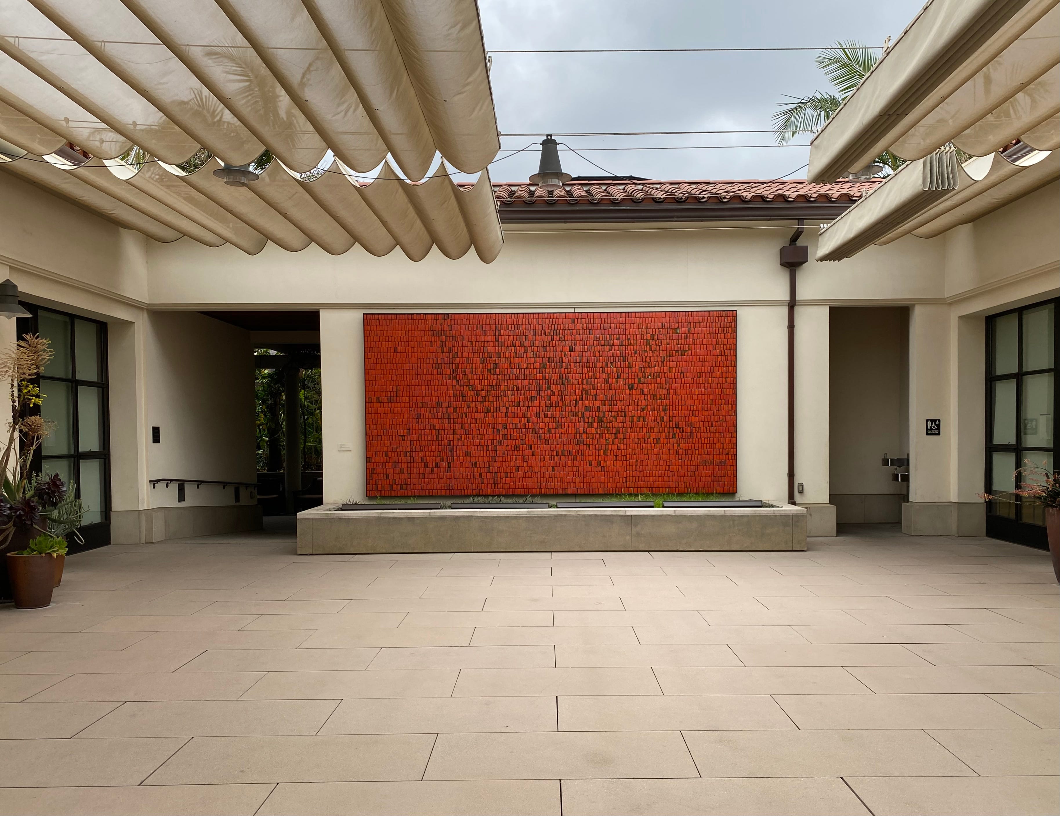
A couple of weeks ago, I found myself in Pasadena where I was tabling for dispersed holdings at the LA Art Book Fair. I had a morning free for art, so I went on a pilgrimage to the Huntington, where I knew there was a rare Doyle Lane “clay painting,” a wall of color made from thousands of ceramic tiles.
The Huntington is a sprawling hybrid of museum and botanical garden, with buildings scattered in a rolling and sloping landscape. The Doyle Lane mural is in the open courtyard of an educational complex near the visitor entrance.
I’ve been entranced by Lane’s work before, in particular by the red glazes he loved, which ranged from poppy to vermillion to burnt orange. This was the intense color my eyes longed for.
— Sal
This Color
Begin with the color: a burnt orange, reddened and smokey, the scent of paprika, red-draped robes in a renaissance painting, the heat and danger at the heart of a fire. It is a color you enter like a place. It is a color that draws you into life.
The color is no blank monochrome, instead it is an ever-shifting array, a vibration. Within the red-orange of the color-field some tiles are lighter, darker, redder, blacker, more orangy. The sides of the tiles are blackened, and sometimes the black flows over the faces. There are bare patches, and spots of celadon green.
Each tile is both the same and different, a replica and a variation. Individual tiles keep to the same height, but are variously wider and narrower. Some are strikingly thick, jutting from the surface.
Looking at field, the eye never needs to rest; it is free to wander, always finding new moments or details, without exhausting what can be seen.
The mural has been given a seemingly friendly site in an open courtyard of the education complex, open to the sky. Yet, as I sit on one of the benches in the courtyard, I watch people come and go through the doorway to the right, which leads to a gender-neutral bathroom. No one who passes spends time looking at the piece. At best, it is an atmosphere, a feeling, a barely noticed sensation.
To enter the spell you have to come in close and let it take over your whole visual field. You have to give it something of yourself.


Doyle Lane
Doyle Lane (1925-2002) was a Black ceramicist, active in the LA scene in the 50s, 60s, and 70s. Though private about his personal life, he was gay, and his work is part of an under-documented history still being recovered.
Lane had spent time as a technical glaze specialist working for a ceramic supply company and loved glazes with unusual textures and hard-to-achieve colors, especially reds. He was best known for his “weed pots”— small vases which you could often cup in one hand, each with a tiny opening lip, ready for a single dried stalk of grass.
To make some money he would carry trays of these to the galleries of friends, to architect’s offices, and even door to door, selling them for between five and twenty dollars a piece. Many of his customers would buy multiples to display in groups.
Now, his work, though collected in a few museums, is rarely displayed and almost impossible to see. The Huntington’s mural (originally commissioned for the Black-owned Mutual Savings and Loan in Pasadena) is an exception. Its situation at the Huntington lets you look for as long as you want as often as you can get there.
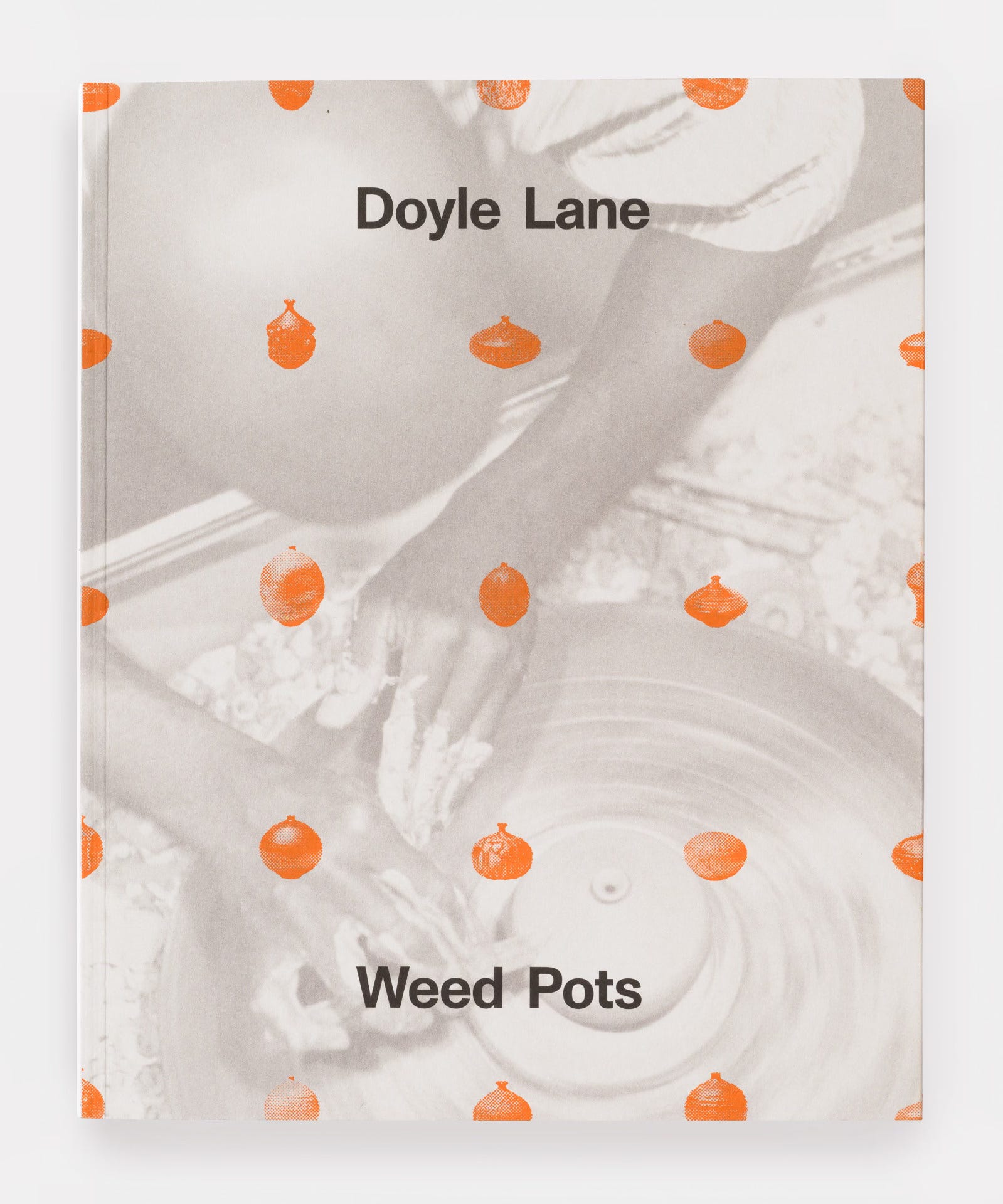
A catalog, Doyle Lane: Weed Pots, is available from David Kordansky gallery.
Artist and curator Ricky Swallow on Doyle Lane.
Read a description of how Doyle Lane’s Mutual Savings and Loan Mural, 1964 was restored before being installed at the Huntington.
On Doyle Lane’s Weed Pots


What is your eye hungry for these days?
Further adventures and new ways of seeing can be found in my book, The Uses of Art.

Artist Sal Randolph’s THE USES OF ART is a memoir of transformative encounters with works of art, inviting readers into new methods of looking that are both liberating and emboldening.
Dazzlingly original, ferociously intelligent.
— Michael Cunningham
A joyful, dazzling treasure-box of a book.
— Bonnie Friedman
Here’s a guide, to waking up, over and over again.
— Roshi Pat Enkyo O’Hara
Oh my goodness Sal!
This piece is unreal. It looks almost edible! I want to dive in! (The room does actually look a little like a pool-adjacent space.) Thanks so much for posting!
Also, immediately, it reminded me of the ICC conference center in Berlin, where there are tiled spaces of a similar colour, though with none of the divine variegation. Some photos here:
https://theunravel.com.au/icc-berlin
One of the things I love about Berlin is the different-coloured tiles in the U-Bahn stations, some of them dating back to the 1920s. Especially the older ones have a good level of imperfection and warm, subdued shades, while some of the ones from the 1970s are quasi-psychedelic.
Here's one of my many favourites, selected in honor of Doyle Lane and his wall of color:
https://en.wikipedia.org/wiki/Rosenthaler_Platz_%28Berlin_U-Bahn%29#/media/File:Ubahn-Rosenthalerplatz.JPG
I've missed train after train just staring at these walls. And now I can add a dimension of California reverie to these moments of zoning out ...
What a gorgeous story and gorgeous colour. I particularly love the variation from tile to tile, speaking of the almost obsessive repetition of process that underlies the work with glazes.